Learning the After Effects Graph Editor
The first time we learn about After Effects, we learn about keyframes. Keyframing is an essential part of creating any action within the program, but it sometimes can be a little limiting. That’s not to put the keyframe down. A lot can be (and has been) done with keyframes and all their attributes, but it can be a time intensive battle that can end with varied results. Sometimes you just have to get in there and visually tweak the details just a bit in order to make your project perfect. This is where the Graph Editor comes into play.
What the Graph Editor Is
The Graph Editor essentially lets you modify keyframes you previously set by adjusting their speed (velocity) and position. You can do that by modifying keyframes as well, but the Graph Editor allows you to more tightly modify them with a bezier curve making it easier for visual creators (like me). All said, the work you do in the Graph Editor gives your animation a more realistic nature.
How To Use It
In order to use the Graph Editor, you have to click on the little icon in the timeline bar that looks like… well, a graph. This will replace your layers with a graph. If you don’t see anything right away, don’t worry. Select an attribute (such as Position) within a layer that has keyframes and you’ll see your graph.
Down at the bottom of the screen will be all of your option for the Graph Editor. I’ll give you a short explanation of each from left to right.
![]() Shows you what you see in the graph: only the properties of the attribute you have selected, all animated (keyframed) properties for that layer, or all the properties you have checked (the box next to an animated property–it looks like a graph–must be check to show up).
Shows you what you see in the graph: only the properties of the attribute you have selected, all animated (keyframed) properties for that layer, or all the properties you have checked (the box next to an animated property–it looks like a graph–must be check to show up).
![]() Shows you what type of information you see in the graph. The two we’ll be focusing on in this example (and for most projects) will be Edit Value Graph and Edit Speed Graph.
Shows you what type of information you see in the graph. The two we’ll be focusing on in this example (and for most projects) will be Edit Value Graph and Edit Speed Graph.
![]() Shows a transform box around keyframes when more than one are selected.
Shows a transform box around keyframes when more than one are selected.
![]() Snaps all keyframes into position when moved.
Snaps all keyframes into position when moved.
![]() Turns on/off auto-zoom. When keyframes are pulled outside the viewing area, the screen automatically resizes to fit. Really, this should be left on at all times. Option (Alt) + Scroll wheel will zoom in/out as well, but only so far.
Turns on/off auto-zoom. When keyframes are pulled outside the viewing area, the screen automatically resizes to fit. Really, this should be left on at all times. Option (Alt) + Scroll wheel will zoom in/out as well, but only so far.
![]() Fits the attribute you have selected in the viewport.
Fits the attribute you have selected in the viewport.
![]() Fits all graphs in the viewport.
Fits all graphs in the viewport.
![]() Gives you the same keyframe options you get with a right click.
Gives you the same keyframe options you get with a right click.
![]() Converts all selected keyframes to Hold keyframes.
Converts all selected keyframes to Hold keyframes.
![]() Converts all selected keyframes to Linear keyframes.
Converts all selected keyframes to Linear keyframes.
![]() Converts all selected keyframes to Auto Bezier keyframes.
Converts all selected keyframes to Auto Bezier keyframes.
![]() Converts all selected keyframes to Easy Ease.
Converts all selected keyframes to Easy Ease.
![]() Converts all selected keyframes to Easy Ease In.
Converts all selected keyframes to Easy Ease In.
![]() Converts all selected keyframes to Easy Ease Out.
Converts all selected keyframes to Easy Ease Out.
Those are the buttons. It’s important to note, the bezier curves act similar to others you may have encountered, but not exactly. You can not angle the handles like you can in Photoshop; you can only push and pull them closer and further away from the keyframe. This initially may cause some frustration, but the more you play with it, the more you’ll get a feel of how the Graph Editor works.
Now For An Example
For this example, we’re doing the favorite of everybody teaching velocity: a bouncing ball. A ball bouncing doesn’t just move up and down; it has variation in speed as it moves. As it nears the top of its bounce, the ball will slow down, then start moving in the opposite direction. A bezier curve in the Graph Editor will allow you to mimic this. Let’s take a look at this in motion with a simple ball bouncing.
Just a note: this example is very simple because if you’ve never used the Graph Editor it is easy to get lost and not be able to wrap your head around how the editor works. Until you get a good grasp on how things work, try simple projects such as this, then move onto larger, more complex projects.
In this example, we are looking at a ball with four keyframes set for position: top starting position, bottom position, back at the top, and back to the bottom once again. As you can see, the ball simply moves down and up again; not very realistic or exciting. That’s because, if we look at the graph editor, the ball is not adjusting velocity. Objects in real life have velocity because of gravity and other mathematics that I’m not going to get into here, but you see it every day from a car coming to a stop to ball bouncing on the basketball court. There’s a few more things I could have done to make this animation a little better, but no matter what I had done, it wouldn’t be realistic. Let’s take a closer look at what’s happening with our ball by examining the Graph Editor.
In the picture above we see the animation of the ball graphed out, and you probably can already tell why the ball isn’t bouncing realistically. However, before we get too deep into that, let’s take a look at the editor to better help us understand how to actually read it.
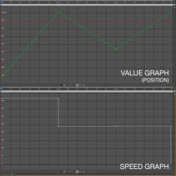
The Graph Editor is set up with two graphs: one for position (Value Graph), and one for speed (Speed Graph).
The Value Graph simply has two lines on it. The green line is for the Y position (vertical) of your object and the red line is for the X position (horizontal) of your object. For our ball example, our graph looks like a line graph with peaks and valleys on the green line, but the red line is flat. That’s because the ball is moving up and down, not side to side. On the graph, the vertical column on the left side of the screen displays the location in pixels of your object while the horizontal position determines time. We, however are not concerned with this graph for our project so we’ll move on to the speed graph.
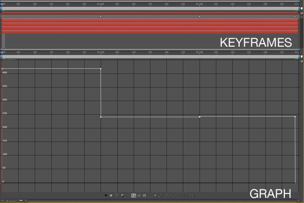
The Speed Graph is set up so the left side of the graph (vertical) measures pixels per second, so the higher the keyframe is on this graph, the faster the object moves. The bottom of the graph measures time, like our other graph. If we compare the speed graph above with our project, we see the first keyframe (when the ball is up) to the second keyframe (when the ball is down) the ball stays a constant speed of about 425 pixels per second. From the second to the third and the third to the fourth the ball stays a constant speed of around 245 pixels per second. No variation in speed (no velocity) is not realistic. Just for fun, let’s compare our animation, keyframes, Speed Graph and Value Graph so we can get a better example of how this ball is moving.
You may have guessed it from the first pic of the speed graph, but know we know for sure: the constant speed of the ball is why it is not realistic. So how do we make it so the ball has velocity? There are a couple of ways we can do this. One is by changing your keyframes to Easy Ease, Easy Ease In and Easy Ease Out. This essentially does the same thing, but it’s the computer controlling how much velocity your object gets. Doing this to our project can get the results below.
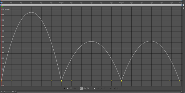
By setting the first keyframe to Easy Ease Out, the two middle keyframes to Easy Ease and the last keyframe to Easy Ease In, we our graph changes drastically to what we see above. There’s a lot of ramping up and down of speed, and the end result is a ball that looks like it’s floating in air rather than bouncing.
The second picture shows what happens when you do Easy Ease Out and In on the first and last keyframes, respectively. There’s some ramping up and down going on at the ends which somewhat works, but the middle is just a flat line with no variation. Not good.
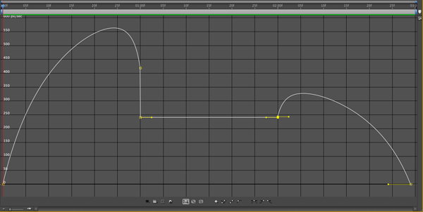
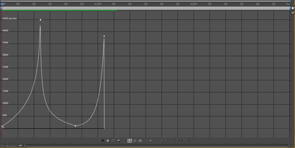
This final image shows what you can do (and drastically change) when you are using the graph editor. Notice the curve from the first keyframe to the second. This gradual curve is what gives the ball the velocity. It, at first, moves slowly from around 10 pixels per second to around 4,500 pixels per second; then it sharply moves back down the opposite way. This is the ball dropping, picking up speed, bouncing back up and losing velocity which makes it fall back down again. That all means it has realistic movement. Let’s take a look.
As you can see in the video, this is dramatically different from the animation in the first video. I’ve noticeably shortened the animation, but I’ve also added a lot of ramping (with bezier curves) which gives it velocity. Because of this, it is more realistic.
That’s all I have for you today (really, do you need a longer article?). I hope you at least attempt to use the Graph Editor on some of your projects in the future as it is the key to creating realistic motion within After Effects. Half the battle is just learning how things operate within the editor itself, but once you do, you’ll be an animating king (or queen). Good luck, and happy graphing!

John Kostrzewski is the Editor of Fuel Your Motionography and a freelance motion graphics and visual effects artist, videographer and writer living in Minnesota. He is awesome. Follow him on Twitter at and .



wooow this past days I digged over the net for a tutorial on how to use the graph editor and found Nothing! It’s so great the you decided to do one! It’s such an IMPORTANT tool to give the ultimate fluid motion look to the animations, but no one seems to care enough to make a tutorial ! hahah. I’ll read it and practice with it later, for now, thank you!! :)
You’re welcome! If you have any questions, please feel free to ask. I’ll try to help you out as best I can.
Very nice tip! This is something I know I should know, but have never really taken the time to play with. Thanks for the lesson!
Yet another very thorough, and helpful post. I really like your style of taking one aspect of AE at a time and diving into it.
I find the best way to learn is 1) hands on, and 2) by breaking things down into specific parts. There’s an old saying that goes something like, “we are only as good as the sum of our parts”. After Effects has some great parts, and you will only really know the entire program by first examining the pieces that make it up.
I’m glad you are digging the site, and I look forward to seeing you back for more!
I have one question for you: what is that little crosshair for?http://img135.imageshack.us/img135/6896/aegrapheditor.jpg
This mark appears when I click graph segment between two keyframes. I can drag it and it is snapping to some values but it seems like nothing is changing in scene and its position returning to initial every time.
Thanks for sharing your knowledge!